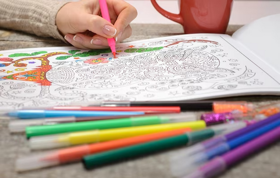
Coloring books aren’t just for children; they are a creative outlet for people of all ages. One of the most crucial aspects of bringing these books to life is choosing the right color palette. Whether you’re an artist creating a coloring book or an enthusiast looking to add life to pre-drawn pages, understanding how to select the right book color palette is essential.
Understanding Color Theory in Color Palette Books
Before delving into the specifics of creating a coloring book palette, it is essential to have a firm grasp of the fundamentals of color theory. Color theory serves as the foundation for designing visually appealing color palettes in coloring books. It encompasses three critical aspects: the color wheel, color harmony, and the psychological impact of colors.
Color Wheel
The color wheel is a fundamental tool in understanding the relationships between colors. It consists of primary, secondary, and tertiary colors. Here’s a breakdown:
| Type | Colors |
| Primary Colors | Red, Blue, Yellow |
| Secondary Colors | Green, Orange, Purple |
| Tertiary Colors | Vermilion, Chartreuse, Magenta |
Primary colors are the base colors from which all other colors are derived. Secondary colors result from mixing two primary colors, while tertiary colors are achieved by mixing a primary color with a secondary color.
Color Harmony
When colors work well together in a palette, we say that they are harmonious. In order to achieve harmony, it is essential to understand different color schemes:
- Complementary Colors: Red and green, which are opposite each other on the color wheel, are complementary colors because they produce a striking contrast and add visual appeal;
- Analogous Colors: Colors that are next to each other on the color wheel, such as teal, green, and blue, produce a peaceful and harmonious appearance;
- Triadic Colors: Three hues that are equally spaced on the color wheel form a triad, which provides a harmonious and lively color scheme.
Color Psychology
Colors have an emotional and psychological impact. To better establish the mood of your artwork, familiarity with these effects is helpful:
- Optimism, enthusiasm, and vitality are qualities linked to the color red;
- Trust, serenity, and peace are conjured up by the color blue;
- Warmth, pleasure, and optimism are symbolized by the color yellow;
- Green represents balance, expansion, and the natural world.
Choosing Your Coloring Book Palette
Selecting the right color palette for your coloring book is a subjective process, but some guidelines can assist you in making informed choices:
- Identify the Mood: Align your colors with the mood of your illustrations. Warm colors like reds and oranges are suitable for energetic scenes, while cool colors like blues and greens work well for serene imagery;
- Limit Your Palette: To maintain a cohesive look, it’s advisable to limit the number of colors you use. Too many colors can be overwhelming;
- Consider the Audience: The age and preferences of your intended audience can influence your color choices. Children may be drawn to bright and bold colors, while adults may appreciate more subtle or sophisticated palettes.
Tips for Effective Color Palettes

To enhance your coloring book palette, consider these tips:
- Experiment with Shades: Varying shades of the same color can add depth and interest to your illustrations;
- Balance Warm and Cool Colors: A mix of warm and cool colors can create a balanced and harmonious visual experience;
- Use Neutrals Wisely: Incorporate blacks, whites, and greys strategically to highlight or downplay specific elements in your artwork.
Tools and Resources for Coloring Book Palette Selection
Fortunately, there are numerous tools and resources available to help you choose the perfect color palette for your coloring book:
- Digital Tools: Software like Adobe Color or Coolors allows you to experiment with different color palettes digitally;
- Color Palette Books: Invest in books specifically dedicated to color palettes for inspiration and guidance;
- Online Communities: Engage with online forums and social media groups focused on coloring and art to gain ideas and feedback from fellow enthusiasts.
Implementing Your Color Palette
Once you’ve chosen your color palette for your coloring book, it’s time to implement it. Here are steps to follow:
- Test Your Colors: Before applying colors to your main illustrations, test them on a separate piece of paper to understand how they interact and ensure they convey the desired mood;
- Start with Base Colors: Begin by laying down the primary colors in your palette, and then build up your illustrations with shades and highlights;
- Pay Attention to Detail: Utilize finer tips or brushes for small areas to ensure precision in your coloring.
Advanced Techniques
For those looking to elevate their coloring book palette, consider these advanced techniques:
- Blending: Learn to blend colors seamlessly to achieve a more realistic and sophisticated effect;
- Layering: Experiment with layering different colors to create new shades and textures in your illustrations;
- Highlighting and Shading: Utilize light and dark colors effectively to add dimension and depth to your artwork, enhancing its overall visual appeal.
Conclusion
Choosing the right color palette for your coloring book can be a fulfilling process that enhances the joy of coloring. By understanding color theory, considering your audience, and using the right tools, you can create a color palette that brings your coloring book to life. Remember, the best color palette book is one that resonates with you and your artistic vision. So, grab your colors and let your creativity flow!
FAQ
Q1: How many colors should be in a coloring book palette?
A: It depends on your project, but a palette of 5-10 colors is often a good starting point.
Q2: Can I use the same color palette for every coloring book?
A: While you can have favorite colors, it’s best to tailor the palette to each book’s theme and mood.
Q2: Are there specific colors that work best for coloring books?
A: No specific colors are best for all coloring books. It varies based on the theme and style of the book.
Q3: How important is color psychology in choosing a coloring book palette?
A: It’s quite important, as colors can significantly impact the mood and feel of the illustrations.
Q4: Can I mix different brands or types of colors in my palette?
A: Yes, feel free to mix and match to achieve the desired effect, but be aware of how different mediums interact.