Gradient color combinations have taken the realm of logo design by storm, injecting it with a burst of lively energy and contemporary aesthetics. The most exceptional gradient color pairings seamlessly merge shades, crafting a visually striking and unforgettable experience. Within the confines of this article, we embark on a journey into the artistry of selecting the most optimal gradient color combinations for logos, exploring the methods to harness these pairings to yield astonishing visuals.
Understanding Gradient Color Combinations
Deep within any remarkable logo lies a meticulously crafted color palette. Gradient color combinations introduce an innovative avenue for showcasing colors in a fluid and dynamic manner. But what exactly is a gradient?
What is a Gradient?
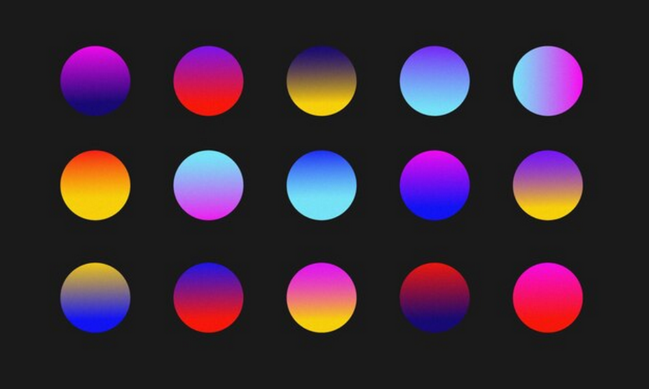
A gradient, within the realm of design, essentially represents a gradual fusion of colors. It enables a seamless transition from one hue to another, birthing a spectrum of shades. Gradients wield unparalleled versatility and can be employed in a multitude of ways. They may manifest as subtle transitions that exude sophistication or as bold, attention-grabbing color transformations. The quintessential key to triumphant gradient color combinations lies in striking an impeccable equilibrium between the intensity and harmony of the colors involved. This ensures that the resultant logo is not only aesthetically pleasing but also effectively communicates the intended message.
Types of Gradients
Gradient color combinations manifest in various forms, each bearing distinctive traits and purposes:
- Linear Gradients: Among the most prevalent types in logo design, linear gradients are characterized by color transitions along a straight path. Their simplicity contributes to their popularity, bestowing a clean and modern appearance. Linear gradients can be aligned horizontally, vertically, or at any desired angle, providing designers with abundant creative freedom;
- Radial Gradients: In stark contrast to their linear counterparts, radial gradients originate from a central point and radiate outward in a circular or elliptical fashion. This creates a captivating fusion of colors that magnetically draws the observer’s gaze towards the center. Radial gradients are frequently employed to evoke a sense of depth and focus in logos;
- Conic Gradients: Conic gradients introduce a circular motif into the mix, akin to slices of a pie, each displaying a distinct color. This gradient variation injects a unique visual element into logos, setting them apart from the crowd. Conic gradients excel at crafting logos with a circular or spherical motif, making them particularly effective in this regard.
Benefits of Using Gradient Color Combinations in Logos
Visual Appeal
The visual appeal of a logo plays a pivotal role in capturing the audience’s attention and leaving a lasting, memorable impression. Gradient color combinations, essentially the seamless transition from one hue to another, create a captivating visual effect, rendering logos vibrant, dynamic, and aesthetically pleasing.
Key Takeaways:
- Gradient colors yield a harmonious blend that is visually striking;
- They grab the viewer’s attention, making the logo stand out;
- The smooth transitions within gradient colors convey a sense of fluidity and elegance.
Depth and Dimension
Gradients may give a flat logo depth and dimension, making it visually fascinating. Gradients simulate three-dimensionality by reproducing light and shadow. This effect makes the emblem feel real and lively, captivating the viewer’s imagination.
Key Takeaways:
- Gradients grant logos a sense of depth through the mimicry of light and shadow;
- The illusion of three-dimensionality enhances the logo’s dynamism;
- Viewers perceive logos with gradients as interactive and immersive.
Brand Identity
Establishing a robust brand identity is a fundamental goal for any business or organization. At the heart of this identity lies a distinctive logo, with color choice being a critical component. Unique gradient color combinations can set a logo apart from competitors and reinforce brand recognition. When deployed effectively, gradients become synonymous with the brand, forging an immediate connection with the target audience.
Key Takeaways:
- Unique gradient color combinations set a brand’s logo apart;
- Consistent use of gradients fosters strong brand recognition;
- An iconic logo featuring gradients becomes a symbol representing the brand’s values and identity.
Crafting the Best Gradient Color Combinations

When striving to craft the optimal gradient color combination for a logo, take into account the following insightful tips:
Start with Color Theory
Begin your journey by delving into the fundamentals of color theory. Two highly effective schemes to explore are:
- Complementary Color Scheme: This scheme pairs colors situated on opposite ends of the color wheel. The stark contrast between these hues generates visual intrigue, leading to striking gradient transitions;
- Analogous Color Scheme: Here, you unite colors neighboring each other on the color wheel. Analogous colors inherently harmonize, facilitating the creation of a gradient that flows seamlessly.
These color schemes serve as a solid foundation for constructing gradient combinations that harmonize and captivate the viewer.
Consider the Brand’s Personality
To ensure that your gradient color combination aligns with the brand’s identity, it’s crucial to contemplate the brand’s personality and message. Different industries and businesses convey distinct qualities through their logos. For instance:
- A tech company may gravitate towards cool blues and purples to evoke innovation, trust, and professionalism;
- An organic brand might favor greens and yellows to communicate freshness, healthiness, and eco-friendliness.
Understanding the emotions and associations specific colors evoke is pivotal when selecting a gradient that resonates with the brand’s essence.
Experiment with Opacity and Direction
The manipulation of opacity and gradient direction can infuse uniqueness and depth into your logo:
- Opacity: Adjusting the transparency or opacity of colors within the gradient can create captivating effects. Subtle transitions between colors or intriguing overlays can add complexity and visual appeal to your logo;
- Direction: The gradient’s vertical, horizontal, or diagonal direction greatly affects the logo’s design. Trying several gradient orientations lets you discover the right balance for your design.
By experimenting with these variables, you can craft gradient color combinations that set your logo apart and enhance its visual impact.
Test Across Various Backgrounds
A logo’s versatility is paramount for its practicality and effectiveness. It’s essential to assess how your chosen gradient color combination appears on diverse backgrounds. This ensures that your logo remains legible and visually appealing across a spectrum of contexts, ranging from digital screens to printed materials.
Use High-Quality Software
Finally, to execute your chosen gradient color combination effectively, it’s crucial to employ professional design software. High-quality software equips you with the necessary tools and precision to create seamless, flawless gradients that adhere to your exact specifications.
Popular Gradient Color Combinations for Logos
Here are some of the best gradient color combinations that are popular in logo design:
| Gradient | Colors | Psychology | Suitable for | Examples |
| Blue to Purple | Blue transitioning to Purple | Blue symbolizes trust, stability, and professionalism, while Purple conveys creativity, luxury, and imagination. The gradient combines the reliability of blue with the allure of purple, making it a versatile choice. | Brands aiming to convey professionalism with a creative twist, such as technology companies, creative agencies, or educational institutions. | Facebook, Yahoo, and Samsung employ variations of the Blue to Purple gradient in their logos. |
| Green to Yellow | Green transitioning to Yellow | Green is associated with nature, growth, and freshness, while Yellow represents optimism, energy, and positivity. This gradient reflects a harmonious blend of eco-friendliness and optimism. | Eco-friendly brands, organic products, wellness centers, or any business focused on sustainability and growth. | Subway and Spotify are examples of brands using the Green to Yellow gradient in their logos. |
| Pink to Orange | Pink transitioning to Orange | Pink signifies femininity, sweetness, and love, while Orange denotes enthusiasm, creativity, and vibrancy. This gradient evokes feelings of youthful exuberance and stands out in a crowd. | Brands targeting a youthful and energetic audience, fashion, beauty, or entertainment industries. | Instagram and Fanta use variations of the Pink to Orange gradient in their logos. |
| Black to Gray | Black transitioning to Gray | Black signifies sophistication, timelessness, and luxury, while Gray represents neutrality, balance, and professionalism. This gradient exudes a sleek and modern aesthetic. | High-end brands, luxury products, technology companies, and businesses striving for a minimalist yet sophisticated image. | Nike and Apple incorporate the Black to Gray gradient into their logos. |
Application in Logo Design
Integrating gradient color combinations into logo design is a multi-faceted process demanding attention to several critical stages:
Conceptualize the Design
Commencing this creative journey necessitates an initial focus on conceptual clarity that aligns seamlessly with the brand’s overarching vision. This preliminary phase entails a whirlwind of brainstorming and sketching endeavors aimed at encapsulating the logo’s quintessential message and aesthetic essence. Key considerations encompass:
- Brand Identity: Immersion in the brand’s ethos, target audience, and market positioning;
- Message Crafting: Determination of the logo’s message, whether it’s projecting trustworthiness, innovation, or other distinctive attributes;
- Style Selection: Picking the overarching style vibe – whether it leans towards minimalism, playfulness, elegance, or another unique facet.
Choose Your Colors
The pivotal task of selecting an optimal gradient color scheme is an art in itself, pivotal for crafting a visually captivating and harmonious logo. Essential factors include:
- Brand Color Integration: Merging the chosen gradient palette with the existing brand color spectrum for coherent branding;
- Color Psychology: Delving into the psychological nuances of colors, as each hue evokes a plethora of emotions and associations;
- Contrast and Harmony Balance: Striking the delicate equilibrium between contrasting and harmonious colors to forge a visually pleasing equilibrium.
Create the Gradient
With the conceptual groundwork laid and colors handpicked, the time has come to fashion the gradient itself. This step necessitates the use of graphic design software such as Adobe Illustrator or Photoshop and involves these intricate steps:
- Software Initiation: Commence by launching your preferred design software, subsequently crafting a new document to accommodate your logo’s desired dimensions;
- Gradient Tool Selection: Within the software’s comprehensive toolbox, the Gradient Tool takes center stage. This sophisticated instrument empowers you to shape and manipulate gradients with precision;
- Gradient Point Definition: Lay the foundation for your gradient on the digital canvas, typically featuring multiple points to facilitate the seamless transition between colors. Tailor their positions and hues meticulously to achieve the desired visual impact;
- Experiment with Gradient Angle: Delve into the realm of experimentation by tweaking the gradient’s orientation and direction, a critical factor in shaping the logo’s aesthetics. Depending on your design, radial gradients or linear gradients may emerge as more suitable choices;
- Finetune Transparency: Where necessary, introduce transparency elements to your gradient. This subtle touch can effectively soften color transitions and imbue your design with depth and dimension.
Incorporate into the Logo
With a meticulously crafted gradient at your disposal, it’s time to infuse it into your logo’s constituent elements. Key considerations encompass:
- Element Selection: Carefully deliberate which facets of your logo will gracefully embrace the gradient’s allure – be it text, shapes, icons, or other visual components;
- Balance and Visual Harmony: Ensure the gradient seamlessly melds with the overarching design, preserving the visual equilibrium that’s pivotal to a striking logo;
- Consistency Across Variations: If your brand boasts multiple logos or variations, diligently uphold consistency in how the gradient is tastefully applied across all iterations, cementing a cohesive brand identity.
Conclusion
The incorporation of gradient color combinations represents a potent tool in the realm of logo design, infusing brand identities with a fresh, dynamic, and modern allure. With meticulous selection and application, designers can craft logos that not only captivate the eye but also resonate deeply with the essence of the brand. As design trends continue to evolve, the versatility and enduring appeal of gradient color combinations in logos solidify their position as a fundamental element within the designer’s arsenal.
FAQ
Q: Can I use more than two colors in a gradient?
A: Absolutely! Multi-color gradients can be highly effective. Ensure a seamless transition between colors to maintain visual cohesion.
Q: Are gradients suitable for all types of logos?
A: While gradients can enhance many logos, they may not align with designs that demand a more traditional or simplistic approach.
Q: How do I ensure my gradient logo looks good in print?
A: It’s essential to test print your logo in various sizes to ensure the gradient retains its quality and color accuracy.
Q: Can gradients be animated for digital logos?
A: Yes, animating gradients can add an extra layer of dynamism to digital logos. Ensure the animation is smooth and complements the overall design.
Q: Is it necessary to use a gradient in the entire logo?
A: Not necessarily. Sometimes, incorporating a gradient into a specific element of the logo can be more effective, depending on the overall design.