Explore the world of color theory in art, from its historical roots to practical applications in various creative fields. Understand the psychology of colors, discover different harmonies, and unravel the science behind color perception. Whether you’re an artist, designer, or enthusiast, this guide deepens your knowledge of color’s role in the art world.
Historical Perspective
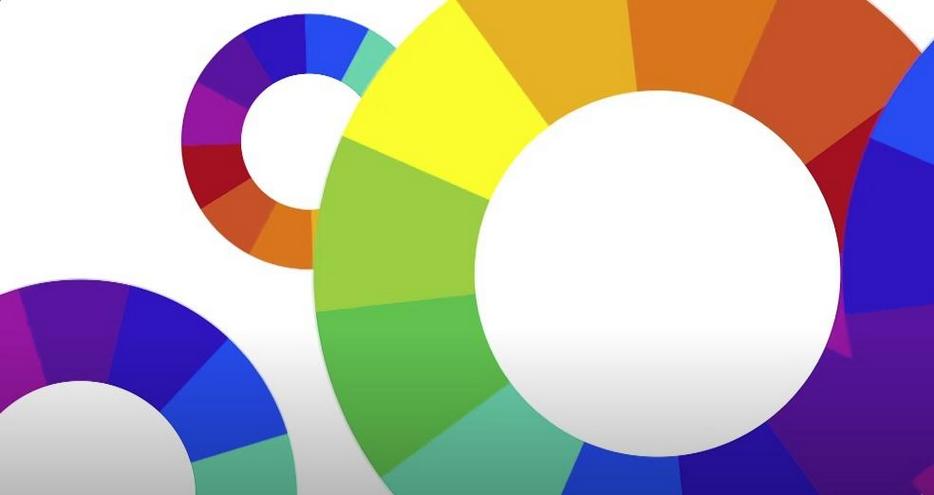
The concept of the color wheel has a rich history that spans centuries. It can be traced back to ancient civilizations, including the works of Aristotle and Leonardo da Vinci. However, it was Sir Isaac Newton who made a significant contribution in the 17th century by creating the first color wheel, which displayed the spectrum of colors produced by passing white light through a prism. This groundbreaking work laid the foundation for our modern understanding of color relationships.
Color Wheel Variations
While the basic color wheel consists of primary, secondary, and tertiary colors, there are various color wheel models and variations used in different fields, such as:
- RYB Color Wheel: This model is often used in art and design and includes red, yellow, and blue as primary colors. It’s the traditional color wheel used for mixing pigments in painting;
- RGB Color Wheel: In digital design and photography, the primary colors are red, green, and blue. Mixing these colors in different proportions creates a wide range of colors seen on screens and displays;
- CMYK Color Wheel: Used in printing, the primary colors in this model are cyan, magenta, yellow, and black (key). It’s essential for creating vibrant printed materials;
- Color Wheels for Colorblindness: There are specialized color wheels designed to accommodate individuals with color vision deficiencies, such as the Ishihara Color Test.
Practical Applications
The color wheel finds extensive use across various disciplines:
- Visual Arts: Artists use the color wheel to create harmonious color schemes, explore contrasts, and convey emotions. It’s a fundamental tool for color mixing in painting, drawing, and other visual art forms;
- Graphic Design: Graphic designers rely on the color wheel to create visually appealing layouts, logos, and branding materials. It helps in choosing color palettes that resonate with target audiences;
- Interior Design: Interior designers use the color wheel to select wall colors, furniture, and decor elements that create cohesive and aesthetically pleasing interiors;
- Fashion Design: Fashion designers incorporate the color wheel’s principles to create clothing collections that are on-trend and visually striking;
- Digital Design: Web designers and UI/UX designers leverage the color wheel to ensure readability, user-friendliness, and an attractive user interface;
- Photography: Photographers consider the color wheel when composing shots, selecting props, and adjusting lighting to achieve desired color effects in their images.
Psychology of Colors
Understanding the psychological impact of colors is essential in design and marketing:
- Red: Evokes passion, excitement, and urgency. It’s often used in clearance sales and for attention-grabbing elements;
- Blue: Conveys trust, calmness, and professionalism. Many corporate logos use variations of blue.
- Yellow: Represents warmth, happiness, and optimism. It’s commonly used in branding to convey a friendly and cheerful image;
- Green: Associated with nature, growth, and health. It’s often used in eco-friendly products and health-related industries;
- Orange: Combines the energy of red and the cheerfulness of yellow. It’s used to create a sense of enthusiasm and excitement;
- Purple: Represents luxury, creativity, and spirituality. It’s often used in high-end brands and artistic contexts.
Color Harmonies
The following color wheel combinations are examples of color harmonies, which are used to create balanced and aesthetically beautiful compositions:
- Complementary Colors: Opposite each other on the color wheel are hues that are considered complementary, such green and red or blue and orange. They make for striking contrasts and eye-catching design elements;
- Analogous Colors: Red, orange, and yellow are examples of nearby analogous colors on the wheel. Combining their hues in a soothing way is their specialty;
- Triadic Colors: The use of three colors spread out evenly on a color wheel creates a triad, which is a balanced and vibrant color scheme;
- Split-Complementary Colors: This color scheme uses a base color and two colors that are next to one other to create a split-complementary effect. It provides a palette that is both complementary and contrasting;
- Tetradic Colors: These color schemes, which use four colors evenly spaced on the wheel, are known for their adaptability and the dynamic compositions they may inspire.
Color in Culture
Colors often carry cultural significance and can have different meanings in various parts of the world. For example, in Western cultures, white symbolizes purity, while in some Asian cultures, it represents mourning. Similarly, red is associated with luck in Chinese culture but may symbolize danger or warning in other contexts. Understanding these cultural nuances is essential when designing for a global audience.
The Science of Color Perception
Color perception is a fascinating and multifaceted topic that bridges both art and science. It is rooted in the fundamental ability of the human eye to perceive various wavelengths of light. This intricate process involves the collaboration of three types of cone cells located in the retina. Let’s delve into the science behind color perception.
The Human Eye and Color Perception
The human eye is a remarkable sensory organ that enables us to perceive the world around us with remarkable detail and clarity. Our ability to perceive colors is primarily attributed to the presence of specialized photoreceptor cells called cones in the retina.
- S-Cones (Short-Wavelength Cones): These cones are sensitive to shorter wavelengths of light, primarily in the blue part of the spectrum;
- M-Cones (Medium-Wavelength Cones): M-Cones respond to medium wavelengths, which correspond to the green part of the spectrum;
- L-Cones (Long-Wavelength Cones): L-Cones are sensitive to longer wavelengths, predominantly in the red part of the spectrum.
These three types of cone cells work in unison to allow us to perceive a wide range of colors by differentially responding to the varying wavelengths of light that enter our eyes.
Color Vision and the Trichromatic Theory
The trichromatic theory, proposed by Thomas Young and Hermann von Helmholtz in the 19th century, is a fundamental concept in the science of color perception. This theory posits that our ability to perceive colors results from the combined responses of the three types of cone cells. Specifically, the brain processes the relative activation of these cone cells to determine the perceived color. This concept can be summarized as follows:
- Red Light: When L-Cones are strongly activated, the brain perceives the color as red;
- Green Light: Predominant activation of M-Cones leads to the perception of green;
- Blue Light: High activity in S-Cones results in the sensation of blue;
- Other Colors: Various combinations of cone cell activation produce all the other colors we perceive.
Color Perception in Digital Displays
Understanding the science of color perception is essential in the development of digital displays. Modern electronic devices, such as computer monitors, television screens, and smartphone displays, rely on the accurate reproduction of colors to provide a visually appealing and informative user experience.
The RGB (Red, Green, Blue) color model is a widely used color representation system in digital displays. It aligns with the trichromatic theory by using these primary colors to create a vast spectrum of hues. Each pixel on a screen is composed of three subpixels, each corresponding to one of the primary colors. By adjusting the intensity of each subpixel, various colors can be synthesized, providing the viewer with a full spectrum of colors.
Color-Matching Systems
Color perception is also crucial in color-matching systems used in various industries, such as printing, graphic design, and interior decorating. These systems rely on the understanding of how colors are perceived by the human eye to ensure consistent and accurate color reproduction.
- Color Spaces: Color spaces like RGB, CMYK (Cyan, Magenta, Yellow, Key/Black), and LAB provide standardized ways to represent and manipulate colors. By using these color spaces, professionals can ensure that the colors they design or print closely match the intended appearance when viewed by others;
- Color Matching in Printing: In the printing industry, understanding color perception is vital for achieving precise color matching. Printers use specialized color charts, such as Pantone, to ensure that the colors specified in a design are accurately reproduced on paper. This meticulous process involves adjusting ink levels and color profiles to align with the way humans perceive color.
Color Terms in Different Art Mediums

Color theory terms vary slightly across different mediums like painting, digital art, and printmaking, adapting to the specific needs and limitations of each medium.
Painting
Painting is one of the oldest and most traditional art forms, and its color theory has evolved over centuries. Here are some key color terms and concepts used in painting:
| Term | Description |
| Hue | Hue refers to the pure, undiluted color on the color wheel. In painting, artists often work with a variety of hues to create visually appealing compositions. |
| Value | Value represents the lightness or darkness of a color. It is essential for creating contrast and defining the form in a painting. |
| Saturation | Saturation, also known as chroma or intensity, describes the vividness or purity of a color. Artists can manipulate saturation to convey mood and atmosphere. |
| Color Wheel | The color wheel is a circular chart that organizes colors in a logical order, helping artists choose harmonious color schemes. It includes primary, secondary, and tertiary colors. |
| Complementary Colors | Complementary colors are pairs of colors located opposite each other on the color wheel. Using them together can create dynamic contrast and vibrancy in a painting. |
| Warm and Cool Colors | Warm colors, like red and yellow, convey warmth and energy, while cool colors, like blue and green, evoke a sense of calm and serenity. Balancing these in a composition can affect the emotional impact of a painting. |
| Color Harmony | When you use colors that are complementary to one another, whether they are triadic (equidistant from each other on the color wheel) or analogous (next to each other on the wheel), you create a harmonious composition. |
Digital Art
Digital art is a modern medium that has its own set of color terms and techniques:
- RGB Color Model: In digital art, colors are typically defined using the RGB (Red, Green, Blue) color model, where various combinations of these primary colors create a wide spectrum of colors;
- Hexadecimal Codes: Colors in digital art are often identified using hexadecimal codes, such as #FF0000 for pure red. These codes ensure precise color reproduction;
- Layers: Digital artists use layers to separate different elements of their artwork. Each layer can have its own color and opacity settings, allowing for easy adjustments;
- Color Sampling: Digital artists can sample colors from existing images or photographs, ensuring accurate color matching and replication;
- Blending Modes: Blending modes in digital art software enable artists to combine colors and layers in various ways, creating unique visual effects and textures.
Printmaking
Printmaking is a medium that involves transferring an image from one surface to another, often using color. Here are some color terms specific to printmaking:
- CMYK Color Model: Unlike digital art, printmaking typically uses the CMYK color model (Cyan, Magenta, Yellow, Key/Black) for color mixing, which is optimized for the subtractive color process of printing;
- Registration: Registration is the precise alignment of different color plates or layers in the printing process to avoid color overlap and misalignment;
- Plate: A plate in printmaking is an engraved or etched surface that carries ink for transfer to paper. Each color in a print requires a separate plate;
- Ink Types: Printmakers often work with various types of ink, such as oil-based, water-based, or relief ink, each with its unique properties and characteristics;
- Impression: An impression refers to a single print produced by applying ink to the printing plate and transferring it onto paper or another substrate;
- Edition: In printmaking, artists often create a limited edition of prints, each signed and numbered. This ensures the exclusivity and value of the artwork.
Conclusion
Understanding color theory terms is essential for anyone involved in the arts. Whether you’re a budding artist or an avid art appreciator, a solid grasp of these terms will enhance your appreciation and execution of artworks. Embracing these color terms in art not only improves technical skills but also deepens the emotional and conceptual impact of creative endeavors.
FAQ
What is the difference between hue and color?
Hue refers specifically to the dominant wavelength of color, while color is a broader term encompassing hue, saturation, and value.
How do color harmonies enhance artwork?
Color harmonies create a sense of balance and visual interest, making the artwork more pleasing to the eye.
Can color theory be applied to black and white art?
Absolutely! In monochromatic art, value plays a crucial role, demonstrating the principles of color theory without the use of hue.
Why is understanding color temperature important in art?
Color temperature can set the mood of a piece, influence spatial perceptions, and guide the viewer’s emotional response.
What’s the best way to learn color terms in art?
Practice and observation! Experiment with creating your own color wheel, and study how artists use color in their work.