Color theory and its mastery is a key determinant in deciphering the complex dynamics of color interactions, contrasts, and harmony that paint our visual aesthetics. This subtle science pervades the spheres of art, graphic design and even the mundanity of our everyday lives – coloring our perceptions of spaces, objects, and information we encounter. Yet an intriguing question frequently surfaces – what then stands as yellow’s antithesis?
Venturing into the labyrinthine depths of color theory illuminates this query through unveiling complementary colors’ concept. On the wheel where all hues reside exists their respective counterpoints; each creating a vibrant contrast that captivates one’s gaze. These pairs held in complementarity – such as yellow with its opposite – engender equilibrium and consonance; virtues highly revered within realms committed to design and visual communication. Comprehending this kaleidoscope-like map navigated by hues unlocks untapped potentials for harnessing colors’ dynamic power to sway favorably towards us.
The Science Behind Complementary Colors
In the enigmatic sphere of chromatic theory, the notion of “complementary colors” commands significant importance. We delve into this thought when we ponder questions like, “What hue stands as the antithesis to yellow?” from a color wheel standpoint. Complementary colors can be defined as duos that, upon merging or blending, birth a neutral shade — usually white, gray, or black. These complementary pairs are located directly opposite each other on the color wheel and provide an optimal contrast and balance when juxtaposed.
Interestingly enough, purple emerges as the complement to yellow in this context. Their union cultivates a neutral or somewhat greyish tone. This idea is anchored in the scientific processes behind light color amalgamation where varying wavelengths of light give rise to distinct hues perception. Herein lies our understanding that colors’ behavior stems from their specific wavelengths and how these are interpreted by human sight receptors. Therefore, converging beams of yellow and purple light yield white light confirming their positions as complementary colors.
Exploring the Color Wheel: Yellow’s Counterpart

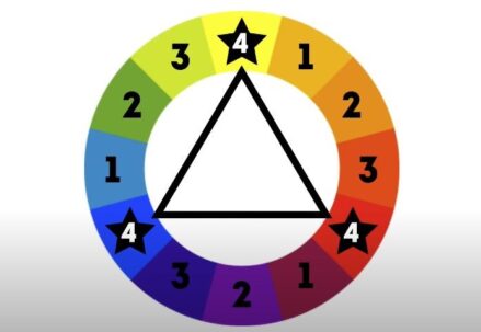
As we plunge into the labyrinth of the color wheel, it reveals a complex web of relationships between hues, their stark differences, and their interplay in differing circumstances. In our quest to decipher “What color forms a contrast with yellow?”, we are compelled to navigate towards its antithesis on the chromatic circle. According to color theory, this antagonist hue – residing diametrically opposite yellow on the circular model – is considered as its complementary counterpart.
In the RGB color sphere’s arcane language, this nemesis happens to bear purple’s name. Traditionally held by art and design purists, an intense purple or violet is hailed as yellow’s authentic complement. This intriguing alliance finds its roots not merely in aesthetics but also deep within light wave science and our visual perceptivity nuances. Remarkably so when these two colors share space; they craft an electric visual dichotomy that invigorates one’s senses while epitomizing complementary color pairing principles at play.
- The color wheel is a complex model that illustrates the relationships between various hues, their stark contrasts, and how they interact in different contexts.
- When seeking to identify the color that forms a contrast with yellow, we are drawn towards its opposite on the chromatic circle – this opposing hue is considered as its complementary counterpart.
- In terms of RGB color theory, this antagonist to yellow is identified as purple.
- Traditional art and design purists have long held that an intense shade of purple or violet serves as the most authentic complement to yellow.
- This pairing of yellow and purple derives from more than just aesthetic preference; it has roots in scientific understanding of light waves and nuances in human visual perception.
- Notably, when these two colors share space, they create a striking visual dichotomy that stimulates our senses while exemplifying principles of complementary color pairing.
Moving forward into deeper exploration:
- Understanding how colors relate to each other can help us make informed decisions about color use in various fields such as fashion design, interior decoration or even marketing strategies.
- Knowing what colors form contrasts with others allows for more dynamic visual compositions – whether it’s creating an eye-catching logo or painting a vibrant piece of art.
- Complementary colors like yellow and purple can be used strategically to draw attention or evoke specific emotions. For instance, using them together could potentially foster feelings of excitement due to their high contrast nature.
In summary:
- Yellow’s counterpart according to color theory is purple – residing diametrically opposite on the circular model
- This intriguing alliance finds its roots not merely aesthetics but also deep within light wave science
- Their combination crafts an electric visual dichotomy invigorating one’s senses while epitomizing complementary colour pairing principles at play.
The Relationship Between Yellow and Its Complementary Color
Venturing into the enigmatic sphere of color theory, one may be perplexed by a question such as ‘What is the antithesis of yellow in terms of color?’ The response to this, rather fascinatingly, lies nestled in the cyclical arrangement known as the color wheel. Herein, yellow resides diametrically opposed to violet. This positioning is not mere happenstance but instead signifies a deeply ingrained connection between science and art that traces its roots back over centuries.
Yellow – an embodiment of joyfulness, warmth, and vitality – finds its counterpart in violet; a hue that symbolizes nuance, intrigue and profundity.
Strikingly enough, despite their positions at polar extremes on the spectrum of colors, yellow and violet strike up nature’s own dichotomy yet harmonize with each other in intriguing ways. They act as complements to each other; amplifying characteristics and intensities when placed adjacently. Consequently ,this unique interplay between yellow and violet can be subtly leveraged by artists or designers for manifold purposes – from eliciting specific emotions or drawing attention to crafting vibrant and engaging visual experiences.
How Light Affects Perceived Color Opposites
In the labyrinth of understanding how luminescence refracts the human comprehension of chromatic antitheses, it becomes an essential preliminary task to dissect and interrogate one fundamental question: what is the opposite hue of gold? Within the time-honored doctrines of color theory, those hues positioned in direct opposition on the cyclical color wheel are bestowed with the label “complementary”. Consequently, in terms of gold – a variant tone within yellow’s spectrum – its complementary counterpart can be identified as purple or violet.
Nonetheless, illumination plays a pivotal role – one that cannot be understated – when discerning these contrasting hues. With variations in lighting conditions comes equally varied perceptions for our ocular senses. This fluctuation has enough potency to shatter preconceived notions about complementarity among colors. Consider this scenario: under dim light or twilight’s soft glow, gold may take on a darker persona — transitioning towards deep yellow or mustard tones — thereby reducing its contrast against its customary complementary partner—purple—to mere whispers instead of loud proclamations. In stark contrast (pun intended), under intense and direct lighting situations, purple might shed some darkness to appear lighter; consequently amplifying its distinction from gold into more pronounced clashes rather than subtle differences.
This multifaceted dance between light and perception then does not only affect how we perceive individual colors but also drastically transfigures our comprehension regarding opposing spectrums in richly complex ways.
Knowing the Implications of Using Complementary Colors in Design
In the labyrinthine universe of design, a calculated dance with colors, notably their complementary counterparts, wields transformative power. The riddle that often emerges from this complex game is – does purple stand as yellow’s nemesis? When we delve into the heart of the traditional color wheel with an inspector’s eye, it reveals an intriguing truth – purple indeed squares off against yellow in direct opposition; a silent testament to being its contrasting mirror image.
The artful orchestration of these polar opposites – yellow and purple – within a design framework can conjure up visually spellbinding dynamics. This duo breathes life into otherwise grayscale canvases, sparking spirited vibrancy. It infuses designs with an undercurrent of kinetic tension that stirs up and revitalizes their inherent essence. Grasping how such dichotomous hues intertwine within a design canvas empowers professionals in making discerning choices towards crafting visually delightful and effective masterpieces.
On the flip side though, overlooking or undermining these stark contrasts could beget lackluster designs that fall flat on charm and fail to seize attention.
The Psychological Effects of Yellow and Its Opposite
In the kaleidoscope of pigments, yellow frequently embodies warmth, joyfulness, and vitality. This inviting shade carries an intrinsic luminosity that has the potential to ignite mental activity, spark inventiveness and elevate our mood. Research indicates a tie between exposure to this animated hue and amplified focus. It’s hardly astonishing that yellow is commonly introduced in environments where intellectual engagement and productivity are necessitated—educational spaces, art studios, professional settings.
Conversely, purple—the color diametrically opposite to yellow—is often indicative of enigma, spirituality, opulence. As this profound midnight tone carries undertones of tranquility and sagacity it forms strong associations with introspection and meditation. In stark contrast with its counterpart—yellow—it doesn’t vie for attention but rather facilitates deeper exploration into one’s internal thoughts and emotions. Consequently explaining its widespread adoption in spaces dedicated towards solitude or contemplation or even therapeutic sessions upholding this perspective.
However when both these colors are united they can shape a balanced dynamic atmosphere intertwining the buoyancy of yellow with the serenity exuded by purple.
FAQs
The essence of color theory lies in comprehending the interaction between different hues and their impact on human cognition and emotional responses. It encapsulates ideas such as primary, secondary, and tertiary colors, along with the concepts of a color wheel, complementary colors, and the psychology behind colors.
Complementary colors come in pairs which when judiciously mixed yield a neutral shade (grey, white or black). They are positioned diametrically opposite each other on a color wheel. This is rooted in the tenets of color blending and how our eyes perceive various shades.
When we look at yellow’s counterpart or complementary hue within a color wheel context it is violet or purple. A combination of these two results in them mutually nullifying each other.
Yellow shares an intense contrast relationship with its counter-color – violet; causing mutual enhancement when juxtaposed side by side. But interestingly they produce neutrality when combined together echoing core principles underpinning color theory.
The way contrasting hues are perceived can shift remarkably depending upon lighting conditions. Different sources of light have potential to either amplify or downplay contrast between two opposing shades plus intensity & quality parameters also mold perception & interpretation aspects related to viewing an array of colours.
Incorporating contrasting tones into design strategies typically generates high-contrast lively aesthetics but ought to be approached cautiously as overdoing could lead to visual discomfort . Such strategic usage often serves drawing attention towards certain design elements .
Yellow is commonly linked to feelings of joy, warmth, and vitality. On contrary, its complementary hue violet typically invokes sentiments associated with creativity, opulence, mystery . The choice of colors can evoke specific emotional responses in viewers due to their personal & cultural associations tied up with these hues. It’s crucial understanding potential psychological implications while crafting design or any other visual narratives using these colors.