Color wields a profound influence on our daily experiences and resonates deeply within the realms of art and design. It is the silent language that speaks volumes without uttering a single word. Amid this intricate interplay of hues, one concept stands out with striking allure – the triadic color scheme. This intricate palette weaves a mesmerizing tapestry of harmony and vibrancy that defies predictability.
Understanding the Triadic Color Scheme
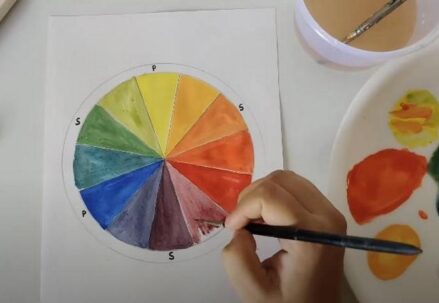
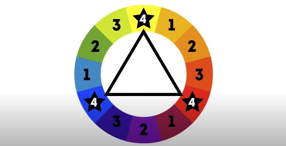
Imagine a color wheel, a radiant circular spectrum of colors, a visual symphony waiting to be composed. Now, envision an equilateral triangle inscribed within this chromatic whirlwind. The points where this geometric marvel touches the wheel are the triadic colors. These hues, meticulously chosen for their equal spacing and high contrast, meld together to form a mesmerizing equilibrium – the essence of the triadic color definition. Bursting with visual intrigue, it is a symphony of colors that dances on the canvas.
Triadic Colors Unveiled in the World of Art
As the name implies, triadic colors are an ensemble of three hues, each positioned equidistantly around the color wheel. This trio is no random selection; it is a strategic orchestration that imbues artworks with harmonious balance, visual depth, and an irresistibly dynamic contrast. When triadic colors share the stage, they command attention and evoke curiosity. Let’s examine these in detail:
Primary Triad: Red, Blue, and Yellow
The primary triad is the elemental core of the triadic color scheme, composed of red, blue, and yellow – the primary colors that lay the foundation for the entire spectrum. This scheme doesn’t tiptoe; it boldly strides into the limelight. When artists fuse these three primaries, they unleash a vibrant crescendo of colors that demand the viewer’s gaze. It is the choice for those seeking to make a statement, an exclamation mark on the canvas.
Secondary Triad: Orange, Green, and Purple
In contrast, the secondary triad beckons with a more subtle allure. Consisting of orange, green, and purple – the secondary colors born from the blending of primaries – this palette offers a harmonious alternative without compromising visual intrigue. Artists turn to the secondary triad when seeking a palette that whispers tranquility and balance, yet still speaks volumes.
Tertiary Triad
Diving deeper into the world of triadic colors, we encounter the tertiary triad, a realm where color sophistication thrives. These triads venture beyond primary and secondary boundaries, embracing hues that nestle between them on the color wheel. Picture the nuanced elegance of red-orange, yellow-green, or blue-violet – these combinations imbue artworks with subtlety and depth, like a well-composed sonata in color.
Examples in Art
To appreciate the practical manifestation of triadic colors, let’s explore masterpieces that have harnessed this concept:
- Piet Mondrian’s “Composition with Red, Blue, and Yellow”: Mondrian’s iconic work epitomizes the primary triad, wielding red, blue, and yellow with geometric precision. The result is a visually captivating composition that resonates with balance and vibrancy;
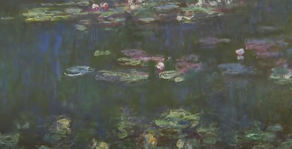
- Claude Monet’s “Water Lilies” Series: Monet’s famous water lilies series is a testament to the secondary triad’s soothing palette. With shades of orange, green, and purple, he conjures an atmosphere of serenity and tranquility that transcends words;
- Vincent van Gogh’s “Starry Night”: Van Gogh’s masterpiece weaves a tale with tertiary triadic colors like blue-violet, yellow-green, and red-orange. This nuanced selection adds complexity and depth to the swirling night sky, breathing life into the artwork.
Implementing Triadic Color Schemes
Creating a successful triadic color scheme transcends the mere selection of three hues from the color wheel. It is an art of balance and harmony, a symphony of colors that resonates visually. To achieve this symphony, one must follow fundamental principles and consider various elements that contribute to the overall composition.
Balance is Key
At the heart of the triadic color scheme lies the concept of balance. It’s imperative to ensure that within this trio of colors, one emerges as the dominant force while the other two gracefully play the role of accents. This balance is the cornerstone of crafting a harmonious and aesthetically pleasing composition.
- Dominant Color: From the triad, designate one color as the dominant hue. This chosen color should typically occupy larger areas within your artwork or design, thereby creating a focal point that commands attention;
- Accent Colors: The remaining two colors are to be employed with restraint, serving as accents. These accent hues can be strategically applied to highlight specific elements, establish contrast, or guide the viewer’s gaze toward particular areas of interest.
Consider Value and Saturation
To infuse depth and dimension into your triadic color scheme, it is essential to consider variations in both value (lightness and darkness) and saturation (intensity) among the selected colors. Here’s how you can manipulate these elements to your advantage:
- Tints: Lighten one or more of the chosen colors by adding white. This yields tints that can be utilized for highlights or to evoke a sense of airiness within your composition;
- Shades: On the contrary, darkening the colors by adding black results in shades that can introduce depth and contrast to your creation;
- Tones: Adjusting saturation levels is achieved by mixing the chosen colors with gray. Tones play a pivotal role in creating subtle variations within the color scheme, ensuring a delicate balance.
Context Matters
The impact of a triadic color scheme is not static; it adapts to the context and surroundings. When implementing this scheme, it’s crucial to consider how your chosen colors interact with other elements in the composition. Several factors should be taken into account:
- Proximity: Colors placed in close proximity to each other exert a more significant influence on each other. Therefore, contemplate how the triadic colors interact when they share adjacency within your design;
- Background: The background color serves as an essential backdrop for your triadic scheme. Experiment with different backgrounds to uncover the most visually appealing combination, as it can significantly affect the overall perception of your composition;
- Contrast: Triadic colors inherently bring about contrast, but the degree of contrast can be fine-tuned by varying the values and saturations of the colors. This subtlety can enhance the overall impact and harmony of your design.
Applications Beyond Art

Triadic color schemes are not limited to the realm of art; they find applications in various domains, including interior design, fashion, and marketing. Their versatility allows for creative and effective color combinations in different contexts.
Interior Design
In the realm of interior design, triadic color schemes serve as a valuable resource for crafting captivating living spaces. Designers harness the power of three evenly spaced colors on the color wheel to create interiors that resonate with balance and aesthetic appeal.
- Dominant Wall Color: The primary color within the triadic scheme often takes center stage as the dominant wall color. For example, a living room might feature one of the triadic colors on its walls, setting the tone for the entire space and creating a cohesive atmosphere;
- Accent Colors: The remaining two colors from the triad are strategically woven into the interior through furniture, decor items, or accessories. These accent colors infuse the space with energy, contrast, and visual interest, ensuring that every corner of the room resonates with design harmony;
- Harmonious Atmosphere: Effective execution of triadic color schemes within interiors results in an ambiance of harmony and sophistication. Designers can experiment with tints, shades, and tones to add depth and dimension to the space, allowing for endless creative possibilities;
- Versatility: One of the key strengths of triadic color schemes in interior design lies in their adaptability to suit various design styles, from modern and minimalist to traditional and eclectic. This versatility makes them a versatile choice for designers looking to create distinctive yet harmonious living environments.
Fashion
Fashion designers, renowned for their creativity and trendsetting prowess, have also embraced triadic color schemes to craft clothing, accessories, and collections that captivate the eye while maintaining a sense of balance and appeal.
- Bold Combinations: Triadic color combinations often result in bold and attention-grabbing fashion designs. Designers typically choose one color as the dominant hue within an outfit, with the other two colors serving as accents in patterns, accessories, or intricate detailing;
- Balance and Coordination: Triadic schemes empower designers to strike a harmonious balance between vibrant, contrasting elements and an overall visually pleasing look. This equilibrium is essential to ensure that the ensemble remains both artistically striking and aesthetically pleasing;
- Expressing Creativity: Fashion designers employ triadic color schemes as creative tools to explore innovative and unique design concepts. These schemes encourage experimentation with color, pattern, and texture, enabling designers to push boundaries and set new trends;
- Seasonal Trends: Triadic color schemes can seamlessly align with seasonal fashion trends, ensuring that collections remain both contemporary and appealing to consumers, thereby contributing to the industry’s dynamic and ever-evolving nature.
Marketing
In the realm of marketing, where visual communication is paramount, triadic color schemes play a pivotal role in creating compelling advertisements, branding materials, and visual content that capture the audience’s attention and convey a message effectively.
- Visual Impact: The inherently attention-grabbing nature of triadic color combinations makes them ideal for marketing materials such as banners, posters, and digital ads. The bold and contrasting colors draw viewers in, sparking curiosity and engagement;
- Brand Recognition: Consistent use of triadic color schemes in branding materials helps establish a strong and memorable brand identity. These schemes evoke specific emotions and associations that align with the brand’s values and goals, contributing to brand recognition and loyalty;
- Message Conveyance: Marketers strategically select triadic color schemes to convey particular messages and moods. Vibrant triads might be used to convey energy and excitement, while muted triads may evoke sophistication and trust, enabling precise communication with the target audience;
- Versatility Across Platforms: Triadic color schemes offer versatility across various marketing channels, from social media graphics and websites to packaging and promotional materials, ensuring a cohesive and visually impactful presence across all touchpoints.
Conclusion
The triadic color scheme definition opens up a world of vibrant possibilities in various fields of art and design. Understanding and effectively implementing this scheme can transform a simple design into something dynamic and captivating. The triadic colors definition in art, in particular, provides a framework for creating balanced yet exciting visual compositions. Whether you’re an artist, designer, or just someone who loves colors, the triadic color definition offers a fascinating lens through which to view the world around you.
FAQ
Q1: Can the triadic color scheme be used in minimalist designs?
A1: Yes, even in minimalism, a triadic color scheme can be effective. Using one color predominantly with subtle accents of the other two can create a minimalist yet colorful design.
Q2: How do I choose the right triadic colors for my project?
A2: Consider the mood and message you want to convey. Use the color wheel to find evenly spaced colors and experiment with different combinations.
Q3: Are there any common mistakes to avoid with triadic color schemes?
A3: Overloading all three colors in equal amounts can be overwhelming. It’s important to balance one dominant color with two accents.
Q4: Can triadic color schemes be used in digital design?
A4: Absolutely. Triadic schemes are great for websites, apps, and digital media, offering a visually appealing and engaging user experience.