Welcome to the fascinating realm of color theory, where we dive headfirst into the captivating world of tertiary colors. These hues are the stars of our discussion today, and they hold the power to infuse life and vibrancy into art, design, and our daily experiences. Get ready to embark on a journey of discovery as we unravel the secrets of tertiary colors.
What Exactly Are Tertiary Colors?
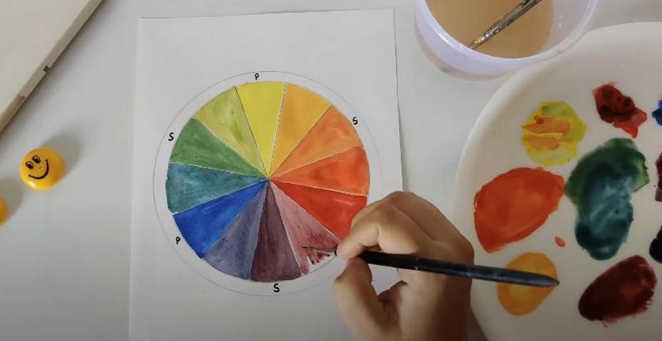
Intermediate or tertiary colors are the result of the successful union of primary and secondary colors on the famous color wheel. Think about it this way: you mix two colors that are next to each other on the wheel, one primary and one secondary. An enchanting tertiary hue is yours for the taking! The artist’s palette would be incomplete without this blending technique, which imparts richness and depth to the final shade.
The Six Tertiary Colors
The six tertiary hues are made by mixing two colors, one primary and one secondary. In order to better understand these colors, we will dissect them into their component parts and examine the traits that emerge from this process:
| Tertiary Color | Components | Description |
| Red-Orange | Red + Orange | Red-orange is a lively and inviting hue that combines the fiery intensity of red with the energetic vitality of orange. Often utilized in designs to elicit powerful emotions, it shows enthusiasm, energy, and creativity. |
| Yellow-Orange | Yellow + Orange | A cheery and optimistic hue, yellow-orange exudes warmth and welcome. The zesty orange and upbeat yellow make a harmonious combination. Its positive connotations and whimsical vibe make it a go-to for upbeat designs. |
| Yellow-Green | Yellow + Green | A vibrant and vivacious shade that combines the best of yellow and green, yellow-green is sure to turn heads. Frequently utilized in designs pertaining to eco-friendliness, health, and the environment, it stands for energy, development, and nature, while also representing balance and harmony. |
| Blue-Green | Blue + Green | A soothing combination of the zen-like blue and the verdant green, blue-green is a color that is both cool and comforting. It makes you feel calm, secure, and at peace. Spa designs and interior decor are common places to see this color because of the calming and balanced vibe it conveys. |
| Blue-Purple | Blue + Purple | The combination of the rich purple hue with the deep blue hue creates the enigmatic blue-purple. It is frequently selected for grandiose and dramatic design projects, such as branding and fashion, because of the air of mystery and refinement it gives off. |
| Red-Purple | Red + Purple | The powerful and dramatic red-purple color scheme combines the fiery red with the regal purple. Used often in lavish, high-end designs, it conveys an air of authority, opulence, and sensuality. |
How Do You Obtain Tertiary Colors?
Understanding the complexities of creating secondary colors through color mixing is vital for delving deeper into their realm. Tertiary colors provide a diverse range of subtle tints to painters, designers, and makers, and they hold a special place in the color spectrum. How can you achieve these mesmerizing hues? Let’s take a closer look:
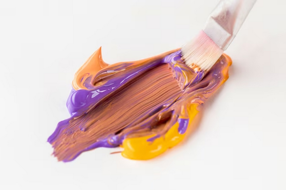
- Mixing Technique: An essential skill for anyone engaged in color mixing is a solid grasp of the color wheel, along with the interplay among primary, secondary, and tertiary colors. Tertiary hues emerge from the strategic blending of two colors found on the color wheel, for instance, red and green. This process involves skillfully melding the best attributes of each parent color to produce a sophisticated and well-balanced shade;
- Selection of Mediums: The variety of media available for tertiary color generation is another facet of its adaptability. Whether you’re using digital tools or more conventional mediums like paints and colored pencils, the rules of color mixing are the same. Although various media call for different approaches, the basic idea of combining primary and secondary colors remains;
- Ratio Experimentation: Tertiary color exploration is characterized by its flexibility in producing a varied spectrum of shades within each tertiary group, which is achieved by ratio experimentation. One tertiary color category can reveal a plethora of variants when the main and secondary color ratios are tweaked. For painters looking to broaden their color palette, this exploration opens them a world of possibilities.
Practical Tips for Mixing Tertiary Colors
Follow these simple steps to improve your tertiary color mixing skills as you begin your quest to become an expert:
- Begin with Small Amounts: When dealing with physical mediums, such as paints, it is wise to begin with tiny quantities of each color. This method permits little tweaks to the color combination up until the target tertiary hue is reached, which reduces material waste;
- Purity of Colors: The key to getting tertiary colors that are both brilliant and clear is to start with primary and secondary colors that are as pure as they can be. If you use colors that are too watered down or have too many hues, it could change the final product from what you had in mind;
- Documentation: Keeping detailed records of the exact color mixing ratios used for different tertiary hues is essential for documentation purposes. If you want your creative projects to be consistent and repeatable, this documentation is a great resource to have on hand.
Tertiary Colors in Design and Art

Tertiary colors are very important in art and design, and their relevance goes beyond color theory. These mid-tones have a lot of sway over compositions and provide a lot of options:
- Creating Depth: Tertiary colors add nuance and richness to your artwork or design, giving it depth. Their existence enables the insertion of subtle color variations, elevating an otherwise unremarkable composition to a captivating visual feast;
- Contrast Enhancement: One effective design technique is to use tertiary colors in contrast to their corresponding ones. To create a visually appealing contrast, try combining warm tertiary colors with cool ones; this will bring life and energy to certain parts of your artwork;
- Harmony Establishment: In order to establish harmony in your creative efforts, it is crucial to carefully choose and use tertiary colors. By bridging the gap between primary and secondary colors, these midtones bring harmony to your color scheme and make your picture flow more smoothly.
Using Tertiary Colors Effectively
Tertiary color integration is an art form in and of itself, requiring a sophisticated strategy at the intersection of creativity and design principles:
- Strategic Color Schemes: To make your color choices harmonious and balanced, use tertiary colors in smart ways. They bring together different colors, giving your design a polished look and feel. They also mix main and secondary colors;
- Accentuating with Tertiary Colors: When used as accent hues, tertiary colors really shine. Their nuanced intricacy can enhance your designs by subtly incorporating depth, refinement, and aesthetic appeal without dominating the whole piece;
- Exploring Contrast: Creating Eye-Catching Effects: Play around with tertiary colors and how they interact with one other to see what happens. Careful use of complementary colors may give your artwork life, making it stand out and connect with others.
Conclusion
Tertiary tints are a captivating and essential component of the color spectrum. Tertiary colors present artists, designers, and color devotees with novel opportunities once they comprehend their nature and acquire them. Tertiary colors enhance the attractiveness and depth of any color scheme, whether you’re designing a website, creating artwork, or simply admiring the hues of nature. Engage in the domain of color, experiment with a variety of tones, and witness the vibrant tertiary hues transform your artwork into existence!
FAQ
Q1: Can tertiary colors be created digitally?
A1: Yes, tertiary colors can be obtained digitally using color mixing tools in graphic design software.
Q2: Are tertiary colors always the same shade?
A2: The shade of a tertiary color can vary based on the mixing ratio of the primary and secondary colors.
Q3: How important are tertiary colors in color theory?
A3: Tertiary colors are crucial in color theory, as they expand the color wheel and provide more options for artists and designers.
Q4: Can tertiary colors be used in branding?
A4: Absolutely! Tertiary colors can be used effectively in branding to create unique and memorable color palettes.