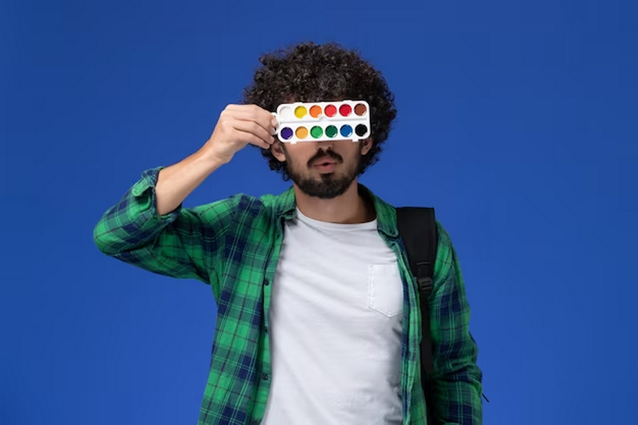
In a world awash with colors, some hues stand out more than others. The study of colors that catch the eye isn’t just about preference or aesthetics; it’s about understanding how our eyes and brains react to different wavelengths of light. This article explores the fascinating world of eye-catching colors, their psychological impact, and practical applications.
The Role of the Eye in Color Perception
The human eye is a remarkable sensory organ, capable of capturing and processing light to interpret the myriad of colors that make up our visual world. This process involves the intricate interplay of several key components:
Light Absorption
The journey of color perception begins with the eye capturing light. The eye’s primary light-absorbing structure is the retina, a layer of specialized photoreceptor cells located at the back of the eye. These cells, known as rods and cones, are responsible for capturing different aspects of light.
- Rods: Rod cells are highly sensitive to light but do not contribute significantly to color vision. Instead, they primarily detect low-light conditions and are crucial for night vision;
- Cones: Cone cells, on the other hand, are responsible for perceiving colors. Humans typically have three types of cones: those sensitive to short wavelengths (blue), medium wavelengths (green), and long wavelengths (red). The combined input from these cone types enables us to see a wide range of colors.
Color Processing
Once the cones capture light of various wavelengths, this information is transmitted to the brain’s visual processing centers. The brain processes these signals and interprets them as the colors we perceive.
The Color Spectrum
A firm understanding of the color spectrum is necessary for appreciating the relative attractiveness of various hues. All the way from red to violet, our eyes can comprehend a wide spectrum of hues. In this spectrum, different colors represent different ranges of wavelengths.
The visible spectrum can be divided into the following primary colors, along with their respective wavelengths:
| Color | Approximate Wavelength Range |
| Red | 620-750 nanometers |
| Orange | 590-620 nanometers |
| Yellow | 570-590 nanometers |
| Green | 495-570 nanometers |
| Blue | 450-495 nanometers |
| Violet | 380-450 nanometers |
These wavelengths are fundamental to our perception of color and play a vital role in determining which colors are more eye-catching.
Why Some Colors Stand Out More
Certain colors are inherently more eye-catching due to their distinct characteristics:
- Brightness: Bright colors, characterized by their high levels of luminance, naturally stand out. Colors like red, orange, and yellow are particularly vibrant and tend to draw our attention. This brightness is a result of their higher reflectance of light in the visible spectrum;
- Contrast: The contrast between a color and its background significantly influences its visibility. Colors that sharply contrast with their surroundings are more likely to catch the eye. For instance, a bright red object against a dark green background will be highly noticeable due to the stark contrast;
- Psychological Impact: Certain colors may have a psychological impact on individuals, making them more eye-catching. For example, red is often associated with urgency and danger, making it stand out in various contexts, from traffic signs to advertising.
The Psychology of Eye-Catching Colors

Colors are not just visually stimulating; they also evoke emotional responses. Here’s how some eye-catching colors influence our psyche:
Red: The Color of Energy, Urgency, and Excitement
Red is a color that exudes a sense of energy, urgency, and excitement. Its vibrant and attention-grabbing nature makes it a favorite in various contexts, from advertising to warning signs. Here’s how red influences our psyche:
- Energy: Red is often associated with high energy levels. When we see red, our bodies tend to respond with increased heart rate and heightened alertness. It can be a motivating and invigorating color;
- Urgency: Red has a strong association with urgency and importance. This is why it is frequently used for emergency signs, stop signs, and alerts. It grabs our attention and signals the need for immediate action;
- Excitement: Red can also evoke feelings of excitement and passion. It’s no coincidence that it is a popular choice for romantic symbols, such as red roses or hearts.
Yellow: The Color of Cheerfulness, Attention-Grabbing, and Warmth
Yellow is a color that radiates cheerfulness, attention-grabbing qualities, and warmth. It is often used to convey positivity and optimism. Here’s how yellow influences our psyche:
- Cheerfulness: Yellow is widely regarded as a cheerful and uplifting color. It can brighten our mood and create a sense of happiness and optimism;
- Attention-Grabbing: Yellow is one of the most eye-catching colors in the spectrum. It grabs our attention quickly, which is why it is often used for warning signs and cautionary labels;
- Warmth: Yellow can evoke feelings of warmth and friendliness. It is often associated with the sun and can create a welcoming and inviting atmosphere.
Orange: The Blend of Energy and Happiness
Orange is a color that combines the energy of red and the happiness of yellow. It is a dynamic and engaging color that is frequently used to draw attention. Here’s how orange influences our psyche:
- Energy and Vitality: Like red, orange conveys a sense of energy and vitality. It can inspire action and enthusiasm;
- Happiness: Orange is a color associated with happiness and joy. It can lift our spirits and create a sense of well-being;
- Attention-Grabbing: Similar to yellow, orange is attention-grabbing and can quickly capture our focus. It is often used in advertising to make products stand out.
Practical Applications: Where Eye-Catching Colors Make a Difference

Eye-catching colors play a significant role in various practical applications, from marketing and advertising to safety and signage, as well as in the realm of art and design. Let’s delve into these practical domains to understand how eye-catching colors are strategically employed to achieve specific objectives.
In Marketing and Advertising
Color psychology plays a critical role in the cutthroat advertising and marketing industry. Colors, according to companies, may pique customers’ interest, communicate brand messages, and sway their purchase decisions. Here’s a practical example of using eye-catching colors:
- Logos: Companies carefully select colors for their logos to create brand recognition and establish an emotional connection with consumers. For instance, the red and white combination in Coca-Cola’s logo is instantly recognizable and associated with excitement and refreshment;
- Product Packaging: Eye-catching colors are used in product packaging to make products stand out on store shelves. Bold and vibrant colors can pique curiosity and encourage potential customers to pick up a product for a closer look;
- Advertisements: Whether in print, digital media, or outdoor billboards, advertisements leverage eye-catching colors to draw viewers’ attention. Bright and bold colors are strategically placed to emphasize key messages and call-to-action elements.
In Safety and Signage
Safety and signage applications rely heavily on eye-catching colors to promote visibility and communicate essential messages effectively. Here’s how these colors are practically utilized:
- Safety Gear: High-visibility colors like bright yellow, neon orange, and fluorescent green are commonly used in safety gear such as construction vests, helmets, and traffic cones. These colors ensure that workers and pedestrians are easily seen in hazardous environments;
- Road Signs: Traffic signs employ specific color-coding for various messages. For instance, red is used for stop signs, indicating the need for an immediate halt, while yellow is used for warning signs to alert drivers to potential hazards ahead;
- Emergency Exits: In buildings and public spaces, emergency exit signs typically feature bright green or red colors to ensure they are easily identifiable in emergency situations.
In Art and Design
Artists and designers are masters at utilizing eye-catching colors to create visually striking and emotionally resonant work. Here’s how these colors find practical application in the world of art and design:
- Visual Impact: Eye-catching colors are employed to create focal points in artwork and designs. These colors draw the viewer’s eye to specific elements or areas of emphasis within a composition;
- Emotion Elicitation: Artists use colors intentionally to evoke specific emotions in their viewers. For example, warm and vibrant colors like reds and yellows can convey energy and passion, while cool blues and greens may elicit a sense of calm and tranquility;
- Branding and Packaging Design: Graphic designers often work closely with companies to develop branding materials and packaging designs that utilize eye-catching colors to make products visually appealing and memorable to consumers.
Conclusion
Attractive color theory combines elements of art, psychology, and science. Many industries, from advertising to public safety, might benefit from familiarity with these colors. The importance of vibrant colors in our everyday lives is becoming more and more clear as our understanding of color perception expands.
FAQ
What Makes a Color Eye-Catching?
A color is considered eye-catching if it has a high level of brightness or contrast, making it stand out to the human eye.
Can Eye-Catching Colors Influence Behavior?
Yes, colors that catch the eye can influence emotions and behaviors. For example, red can create feelings of urgency, while yellow can evoke cheerfulness.
Are Certain Colors More Eye-Catching Than Others?
Yes, colors like red, yellow, and orange are typically more eye-catching due to their brightness and ability to stand out.
How Do Eye-Catching Colors Affect People with Color Blindness?
People with color blindness might perceive eye-catching colors differently. For example, red-green color blindness may affect how individuals perceive these colors.