As a medium for expression, depth, and harmony, color is essential in the visual arts and design. The concept of divided complimentary hues is unique among the many color schemes that are employed. This article explores the meaning of divided complementary hues in art, delving into its subtleties, uses, and effects.
What are Split Complementary Colors?
The idea of split complementary colors is an important part of color theory. They are a variation of the complementary color scheme. A split complementary scheme is different from a complimentary scheme because it uses three colors instead of two. The three colors are not the two colors that are across from each other on the color wheel. This color scheme is made up of one main color and two secondary colors that go well with it. In the end, there is a nice effect with a lot of contrast that is clearly less harsh and harsher than the traditional complimentary scheme. This fine detail gives works depth and beauty.
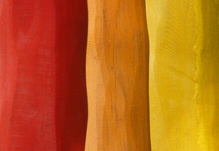
The following example will help you understand this idea better: With blue as the base color, the split complementary scheme would be made up of orange-red and orange-yellow. The orange-red and orange-yellow colors would be put next to orange, which is blue’s direct complement. This mixture makes a beautiful piece of art that flows well together.
Characteristics of Split Complementary Colors
Split complementary colors possess several distinct characteristics that make them a valuable tool in the arsenal of artists and designers:
- High Contrast: The primary feature of a split complementary color scheme is the striking visual contrast it offers. However, it achieves this contrast in a gentler manner compared to the traditional complementary scheme;
- Versatility: This color scheme’s versatility is evident in its applicability across various art forms and design applications. It adapts well to a wide range of creative endeavors;
- Balance: Split complementary colors strike a harmonious balance between warm and cool tones. This equilibrium makes them particularly well-suited for achieving pleasing and well-balanced visuals.
Applications in Art
The definition of split complementary colors in art extends to a multitude of practical applications. Artists often employ this scheme to create dynamic compositions that avoid the high tension typically associated with a standard complementary scheme. Here are some key applications in the realm of art:
- Painting: Many painters leverage split complementary color schemes to infuse depth and visual interest into their works. For instance, a painting might prominently feature blue (the primary color), while incorporating orange-red and orange-yellow (the split complements of blue) to craft a vibrant yet harmonious scene. This combination adds both contrast and balance to the composition;
- Graphic Design: Graphic designers frequently turn to split complementary colors to craft eye-catching designs. This color scheme offers an appealing blend of contrast and harmony, making it particularly suitable for various design projects, including marketing materials, websites, and branding efforts;
- Interior Design: In the realm of interior design, the use of split complementary colors helps create lively and well-balanced spaces. For example, a room dominated by green as the primary color may include accents of red-orange and red-violet. This infusion of split complementary colors results in a cohesive yet dynamic ambiance within the space.
Why Use Split Complementary Colors?
The use of split complementary colors in art and design is a nuanced and powerful technique that offers a plethora of advantages. These colors strike a harmonious balance between contrast and unity, creating visually captivating compositions that engage viewers on multiple levels. Let’s explore why split complementary colors are an essential tool for artists and designers:
- Visual Interest and Engagement: One of the primary reasons to embrace split complementary colors is their ability to capture and maintain the viewer’s attention. This color scheme achieves a captivating equilibrium between contrast and harmony, making the composition visually stimulating without overwhelming the observer. The result is an engaging and aesthetically pleasing experience that encourages prolonged observation and exploration;
- Versatility and Flexibility: Split complementary colors are incredibly versatile and adaptable, making them suitable for a wide range of artistic and design applications. Whether you are working on digital graphics, interior design, fashion, or fine art, these color schemes can seamlessly integrate into your creative endeavors. Their flexibility ensures that they can evoke the desired emotions and convey the intended message across diverse mediums and styles;
- Harmony and Balance: Unlike the more conventional complementary color schemes that rely on colors positioned directly opposite each other on the color wheel, split complementary colors take a more nuanced approach. They use a base color and its two adjacent neighbors to create a harmonious balance. This approach often evokes a sense of unity and cohesion in your designs, fostering a pleasant and welcoming atmosphere.
Examples of Split Complementary Colors
Let us now explore specific instances of split complementary color combinations to delve deeper into their versatile applications:
| Color Scheme | Description |
| Blue, Red-Orange, Yellow-Orange | This color scheme combines the tranquil and serene essence of blue with the fiery, intense allure of red-orange and the invigorating, lively tones of yellow-orange. It creates a visually captivating palette that exudes energy and dynamism. The calming blue provides a stable backdrop, allowing the warmth of red-orange and the brightness of yellow-orange to stand out, making it ideal for designs that aim to be vibrant and full of life. |
| Red, Blue-Green, Yellow-Green | This trio of hues merges the bold and assertive presence of red with the soothing, refreshing qualities of blue-green and the lively, organic shades of yellow-green. The combination results in a warm, inviting, and visually harmonious design. The contrast between the vibrant red and the cooler blue-green and yellow-green creates a balanced and aesthetically pleasing palette, perfect for a wide range of applications from interior design to branding. |
| Yellow, Violet-Blue, Violet-Red | The blend of the radiant, warm yellow with the more subdued, cooler shades of violet-blue and violet-red offers a unique and spirited color palette. The cheerfulness of yellow is perfectly complemented by the depth and sophistication of violet-blue and violet-red, creating a balanced and captivating design. This scheme is ideally suited for designs that aim to be playful, optimistic, and full of energy, capturing attention with its lively and positive vibes. |
Tips for Using Split Complementary Colors Effectively
Now that we’ve explored the advantages and examples of split complementary colors, let’s delve into practical tips for harnessing their potential in your designs:
- Start with the Base Color: The key to successfully using split complementary colors is to begin by selecting your main color, which will serve as the focal point of your composition. Once you have your base color, identify its complementary color on the color wheel. The two colors situated on either side of this complement are your split complements. This method ensures a harmonious relationship between the colors;
- Balance Proportions: Achieving balance is essential in split complementary color schemes. To do this, use the main color as the dominant hue within your design. Allow the split complementary colors to act as accents, ensuring they enhance the overall composition without overpowering it. Striking the right balance will create a visually pleasing result;
- Consider Value and Saturation: Experiment with variations in value (brightness) and saturation (intensity) of the colors to achieve the desired effect. Adjusting these aspects of the colors allows you to fine-tune the visual impact of your design. Subtle shifts in value and saturation can significantly influence the mood and tone of your composition.
Conclusion
The definition of split complementary colors in art is not just a technical term but a gateway to creativity and balance in visual composition. Whether you’re a painter, graphic designer, or interior decorator, understanding and applying this color scheme can elevate your work, bringing harmony, contrast, and vibrancy to your creations. Remember, color is more than just a visual element; it’s a language that speaks directly to the emotions and perceptions of the viewer.
FAQ
Q: Is the split complementary color scheme suitable for beginners in art?
A: Yes, it’s an excellent choice for beginners. It’s simpler to balance than a standard complementary scheme and offers flexibility and ease of use.
Q: Can split complementary colors be used in digital art?
A: Absolutely. Digital artists often use this scheme for its versatility and visually pleasing results.
Q: How do split complementary colors affect the mood of a piece?
A: They can create a variety of moods depending on the chosen colors. Generally, they offer a balance of warmth and coolness, creating a harmonious yet dynamic atmosphere.