For designers, painters, and anyone else curious about the interplay, emotional impact, and perceptual shaping of colors, color theory is an enthralling and essential field of study. To help you understand color theory, we’ve compiled a list of the top textbooks on the subject and gone into detail about why they’re important.
Why Color Theory Books are Essential
Reading books on color theory is like opening a door to a world of visual fundamentals; they’re more than just textbooks. The following are some of the many benefits of reading a color theory book:
Foundation of Visual Arts
To become an expert color user in a variety of creative fields, color theory books are essential reading. A strong grasp of color theory is essential for anyone working in the visual arts, whether that’s as an artist, graphic designer, decorator, or photographer. The following is some basic information that these books give:
| Key Concepts | Explanation |
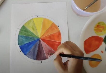
| Color Wheel | The color wheel is a graphic depiction of the relationships between colors that is introduced in color theory texts. For successful color selection and blending, it’s a must-have tool. |
| Color Properties | Essential to the development of aesthetically pleasing compositions, you will gain knowledge of color attributes like hue, saturation, and brightness. |
| Color Mixing | You may create the desired tints and tones in your work by understanding how colors mix and interact. |
| Color Schemes | To help you build visually beautiful designs, color theory books teach several color schemes such as triadic, analogous, and complementary. |
Psychological Insights
Books on color theory can teach you a lot about the psychological and behavioral effects of various hues. In many domains, both design and communication rely heavily on this information. The psychological effects of color are examined further here:
| Psychological Effects | Explanation |
| Mood and Emotions | People feel different emotions when they see different hues. For instance, whilst blue might represent tranquility and reliability, red can represent fervor and vitality. |
| Cultural Significance | Cultural associations and meanings can be conveyed through color. Projects involving global design must take into account these cultural peculiarities. |
| Color Preferences | To better cater their work to specific audiences, designers might benefit from these publications that investigate demographic and individual color preferences. |
| Color in Marketing | Branding and marketing campaigns often make strategic use of color to sway customer decisions. These tactics are explained in color theory texts. |
Enhanced Creativity
People can greatly improve their creative abilities and make educated design decisions by understanding the complexities of color harmonies and relationships. Color theory encourages originality in the following ways:
| Creative Benefits | Explanation |
| Color Combinations | By understanding color harmonies, designers and artists are able to craft more aesthetically pleasing and balanced pieces. |
| Problem Solving | By guiding you toward the most appropriate color choices for each given task or idea, color theory promotes imaginative problem-solving. |
| Expressive Potential | When you have a firm grasp on color theory, you’ll be more equipped to use art to communicate thoughts, feelings, and messages. |
| Innovation | Exploring new territory in color theory frequently leads to groundbreaking design innovations that provide eye-catching, one-of-a-kind visual experiences. |
Choosing the Right Color Theory Textbook

When searching for the perfect color theory textbook, consider the following aspects:
Audience
When selecting a color theory textbook, it is important to keep the target audience in mind. You can get color theory books for beginners as well as those for more advanced students. Make sure your understanding of color theory is up to snuff with the book’s difficulty level. Various audience levels are presented below:
- Beginner: Select a textbook prepared for newcomers to the field of color theory if you are just starting off. The essential ideas, vocabulary, and color connections are usually laid out in an easy-to-understand way in these works;
- Intermediate: If you already know a little bit about color theory but would like to learn more, you might want to look at intermediate-level texts. These tend to get into somewhat more complex subjects like color harmony, color psychology, and color mixing;
- Advanced: Textbooks aimed at more advanced students, designers, or color enthusiasts who want to delve further into color theory will cover all the bases. These publications provide in-depth explanations of complex color theory, along with examples and case studies to illustrate the theory in action.
Content Focus
Next, think about what the color theory textbook mostly covers. You should choose a book on color theory that fits your interests and objectives for learning, since different ones may focus on different parts of the theory. Some typical points of emphasis are as follows:
- Color Psychology: If you’re interested in learning more about the psychological effects of colors and how they affect people’s actions, you may find books that cover color psychology in textbooks. Marketers, designers, and psychologists can all benefit from these publications, which delve into the cognitive and emotional reactions to different hues;
- Color Harmony: The art of color harmony is the science and practice of creating aesthetically beautiful color schemes via the coordinated use of specific hues. Creating color schemes, understanding color relationships (e.g., analogous, triadic), and achieving aesthetically acceptable designs are commonly covered in textbooks that focus on color harmony;
- Practical Applications: Some color theory textbooks focus on real-world examples and exercises, which is great for professionals in the fields of art, design, and architecture. Color theory in digital design, color mixing, and industry-specific color palettes (for instance, web design, interior design, and fashion) are some of the subjects that these publications may address.
Author Expertise
The content quality of a color theory textbook is greatly affected by the reliability and experience of the author(s). You should think about the credentials and experience of the author while assessing possible textbooks. Here are a few important things to consider:
- Experience: Has the writer worked as a color theorist, designer, or educator before? Having hands-on experience can greatly enhance the content with practical insights and a real-world perspective;
- Credentials: Certifications or degrees in art, design, or color theory are good indicators of credibility, so be on the lookout for such writers. Having these qualifications might show that you have a good grasp of the material;
- Publication Record: Verify the author’s track record of published work and the impact they’ve had in the field. Reputable textbooks and essays on color theory may be written by esteemed authors.
Highlighting Top Color Theory Books
Here, we spotlight a selection of renowned color theory books, each offering unique perspectives and valuable knowledge:
“Color Theory: An Essential Guide”
- Author: John Doe;
- Publication Year: 2020;
- Pages: 250;
- Target Audience: Beginners.
“Color Theory: An Essential Guide” by John Doe provides a thorough overview of color theory’s fundamentals. For those just starting out, this is the perfect book to lay a solid groundwork in color theory. The psychology of color, color harmony, and the color wheel are some of the subjects covered. Briefly, these are its salient characteristics:
| Key Features | Description |
| Introduction to Color Theory Concepts | Covers primary, secondary, and tertiary colors. |
| Understanding Color Harmony | Explains complementary, analogous, and triadic color schemes. |
| Practical Color Application | Offers guidance on color mixing and choosing palettes. |
| Psychological Impact of Colors | Explores how colors can affect emotions and perceptions. |
| Color in Art and Design | Highlights real-world applications in various fields. |
“The Art of Color”
- Author: Jane Smith;
- Publication Year: 2019;
- Pages: 350;
- Target Audience: Advanced Learners.
An sophisticated color theory book that explores intricate ideas and their artistic applications is “The Art of Color” by Jane Smith. Anyone interested in color theory and how it is applied in the real world will benefit greatly from reading this book. Briefly, these are its salient characteristics:
| Key Features | Description |
| Advanced Color Theory Concepts | Explores color in greater depth, including color temperature, saturation, and more. |
| Color Interaction and Optical Effects | Discusses how colors interact, create optical illusions, and affect perception. |
| Case Studies and Exercises | Provides practical exercises and real-world examples. |
| Contemporary Color Trends | Explores current trends in color theory and design. |
| Applications in Art and Design | Demonstrates how to apply advanced color theories in creative projects. |
“Color Psychology and Color Therapy”
- Author: Susan Johnson;
- Publication Year: 2021;
- Pages: 280;
- Target Audience: Those Interested in Psychology and Therapy.
Susan Johnson’s “Color Psychology and Color Therapy” delves deeply into the how color affects our emotions and actions. Beyond the realm of conventional color theory, this book explores the therapeutic and psychological effects of color. Briefly, these are its salient characteristics:
| Key Features | Description |
| The Psychological Impact of Colors | Examines how colors can evoke emotions and impact mental states. |
| Color Therapy Techniques | Introduces color therapy practices for emotional well-being. |
| Cultural and Historical Significance | Explores how colors have been perceived throughout history and in different cultures. |
| Case Studies and Practical Exercises | Provides hands-on exercises and case studies for application. |
| Color in Healing and Wellness | Discusses the role of color in holistic approaches to health and well-being. |
Applying Color Theory: Practical Tips

Implementing the knowledge gained from a color theory book can transform your artistic or design work. Here are some practical tips:
Experiment with Color Harmonies
Harmonious color schemes are those in which the various hues complement one another and provide aesthetically attractive results. One way to improve one’s creative or design work is to learn about and play around with different color harmonies. Some important color schemes to consider are these:
- Complementary Colors: Colors that are opposite one another on the color wheel are called complementary colors. For instance, a combination of green and red, or blue and orange. Complementary colors are vibrant and striking when used in conjunction with one another. You can use them to highlight certain parts of your design;
- Analogous Colors: Colors that are next to one other on the color wheel are called analogous colors. Because of their shared tones, these hues work well together to produce a unified aesthetic. Including a range of green and blue hues in a design inspired by nature is one such example;
- Triadic Colors: When creating a triad, you should aim for three hues that are equally separated on the color wheel. A visually pleasing and well-balanced palette is the result. As an example, a vibrant and striking composition can be achieved by combining red, blue, and yellow;
- Split-Complementary Colors: As a variant on the complementary color scheme, split-complementary colors are used. It starts with picking a base color and continues with picking two colors that are next to each other. This allows for a broader spectrum of colors to be utilized while simultaneously establishing a balanced contrast;
- Monochromatic Colors: Using a wide range of tones and tints of one color is called a monochromatic color scheme. You may create a specific mood or ambiance with this method, which creates a sense of harmony and simplicity.
If you want to learn more about how colors affect one another in creative contexts, trying out different color harmonies is a great place to start. It is easier to see and choose complementary color schemes with the help of software tools such as Adobe Color Wheel.
Understand Context
Colors have cultural and contextual meaning; they are not chosen at random. Think about these things to make smart choices while using color theory:
- Cultural Significance: Colors evoke different feelings and signify different things in different cultures. For instance, whereas one culture may associate the color red with good fortune and love, another may associate it with peril. To ensure your design connects effectively, it’s a good idea to research the cultural implications of colors;
- Audience Preferences: Learn about the cultural origins and personal preferences of your intended audience. Make sure to consider their preferences and sensitivities while selecting colors.
- Contextual Relevance: Consider the purpose and context of your project. Is it a corporate logo, a wedding invitation, or a healthcare brochure? Each context may require a unique color palette to convey the intended message effectively;
- Psychological Impact: Different hues are associated with different feelings and dispositions. To illustrate the point, bright colors (red, orange, etc.) can inspire a sense of vitality and activity, whereas cold colors (blue, green, etc.) might symbolize peace and reliability. Put this information to use by appealing to your audience’s emotions.
Practice with Projects
The best way to master color theory is through practical application. Here’s how to integrate color theory into real-world projects:
- Start Small: Begin by experimenting with color theories in smaller, low-stakes projects, such as personal artwork or mock designs. This allows you to build confidence and refine your skills;
- Seek Feedback: Share your work with peers, mentors, or online communities to receive constructive feedback. They can provide valuable insights and help you identify areas for improvement;
- Analyze Successful Designs: Study successful designs in various fields, paying close attention to their color choices. Analyze why certain color combinations work well and apply those principles to your own work;
- Keep a Design Journal: Maintain a design journal where you document your color choices, inspirations, and the effects they have on your projects. This will serve as a valuable reference for future endeavors;
- Iterate and Refine: Don’t be afraid to iterate and refine your color schemes. Experiment with different variations until you achieve the desired visual impact.
Conclusion
Incorporating the knowledge from a color theory book into your artistic or design work can make a profound difference. Whether you are a beginner or an experienced professional, there’s always something new to learn from the vast array of color theory textbooks available. Dive into a book on color theory today and watch as your understanding and application of color transforms!
FAQ
Q1: Do I need a background in art to understand a color theory book?
A1: Not necessarily. Many color theory textbooks are written for a general audience and start with the basics, making them accessible to everyone.
Q2: How can a color theory book help in digital design?
A2: A color theory textbook can provide essential knowledge for creating visually appealing and effective designs in digital media, from websites to digital art.
Q3: Are there color theory books focused on specific industries like fashion or interior design?
A3: Absolutely. There are color theory books tailored to various industries, offering specialized insights relevant to those fields.
Q4: Can studying color theory improve my painting skills?
A4: Definitely. Understanding color theory can significantly enhance your ability to mix colors and create more dynamic and harmonious compositions in painting.