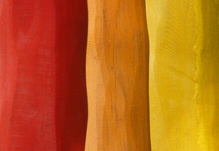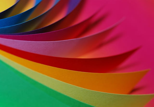
Sir Isaac Newton’s 17th-century invention, the color wheel, is a cornerstone for comprehending the principles of color theory and its functional applications – most prominently in fashion and personal style. This twelve-hued circle can be dissected into three sections: primary colors (red, yellow, blue), secondary colors (orange, green, purple) born from crossing two primaries together and finally tertiary shades arising from blending a primary with an adjacent secondary hue. Acting as a practical compass guiding us through the maze of color mixing and harmonious scheme selection – it’s indispensable when orchestrating our sartorial choices.
In this context, mastering the color wheel becomes pivotal for identifying optimal clothing hues for male with fair complexions. A deep-dive into complementary, analogous, and triadic schemes could unlock numerous new aesthetic possibilities. Specifically speaking about skin undertones like pink or blue which are often linked to lighter complexion males – these subtle nuances will echo in their wardrobe palette choice. Without question – harnessing the power of the color wheel as an advisory tool can amplify one’s capacity to express individuality via clothing choices while also presenting opportunities to fine-tune visual aesthetics especially tailored towards fair-skinned men.
Identifying Your Skin Undertone: The Key to Perfect Clothing Colors
A labyrinth of color choices exists within the realm of personal fashion, hinged precariously on a subtlety that eludes many: the understanding of one’s skin undertone. A crucial factor, it serves as an unsung hero in determining which colors elevate or deflate an individual’s aesthetic appeal. Yet, this unseen essence that deeply influences sartorial decisions remains unknown to many.
This mysterious undertone is not to be confused with common references to skin shade ranging from pale through light and medium to dark. It falls instead into three distinct categories – warm, cool, neutral – each playing its unique role in deciding what shades will bestow grace upon their wearer or serve as a sartorial misstep.
The conundrum often heard by those graced with lighter complexions is: “What colours don’t suit pale skin?” This question gains gravity when considering the vast spectrum of hues displayed proudly across men’s fashion landscape presently. Intriguingly though, the answer isn’t universal but varies greatly depending on one’s specific undertone.
For example, individuals who perceive their skin undertones as cool might find certain tones of yellow or orange less appealing while those imbued with warm undertones may discover blues and purples do them little justice aesthetically. Thus grasping this basic aspect helps navigate the wild seas of color theory effectively; allowing men to make informed choices aligning perfectly with their personal style and thereby magnifying overall appearance.
Role of Color Contrast in Men’s Fashion
In the universe of couture, the notion of color contrast holds a colossal place in its core, particularly in making choices about colors that either mirror or enhance an individual’s skin tone. Fascinatingly, this rule considerably transforms how various tints and shades will manifest against a specific skin tone and subsequently impacts the overarching aesthetic. The query “Do dark hues suit pale skin better?” recurrently arises within this ambiance, illuminating the essentiality of comprehending color contrast.
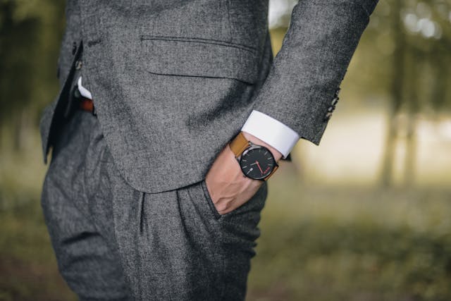
Dark tones frequently synonymous with sophistication or having a slimming effect can create an abrupt juxtaposition against light skin. Such starkness might verge on being too severe and uncomplimentary. It could highlight light pigmentation of your skin even more so than before while drawing unwanted attention towards blemishes or other complexion flaws. Nonetheless, if employed judiciously dark hues may act as remarkable backdrops allowing features like hair or eye color to truly pop out from their canvas. This underlines once again that successful execution of color contrast in menswear isn’t simply fashion but rather an art form demanding sharp focus on detail.
To fully grasp one’s undertones along with trying out varying palettes is integral to such process.
Choosing the Right Shades for Light Complexions
For those blessed with a lighter hue to their skin, a perpetual conundrum often arises: what clothing shades best accentuate their delicate complexion? The question also extends to the realm of hair colouring. “What hair colours suit pale skin?” echoes in countless fashion forums and beauty parlours. One must understand that an abundance of splendid options lies ahead.
Darker hues, like the deep blue sea’s navy or the soft glow of charcoal, even the royal tones of burgundy and eggplant seem to dance beautifully against light complexions. These colours have this uncanny knack for casting a luminescent aura around paler skins while simultaneously adding an air of elegance and suavity to one’s appearance.
Switching gears slightly, let us delve into another essential aspect—hair color—whose importance cannot be overstated when it comes to complementing fair complexions. Responding accurately to “What hair colors are compatible with pale skin?” involves sifting through numerous variables such as undertones within one’s skin and eye color. Professionals entrenched in this field offer nuggets of wisdom; cooler shades on the spectrum like platinum blonde, ash brown or jet black can look incredibly striking against fair-skinned individuals if balanced correctly. Achieving equilibrium between your mane’s shade and your complexion is indeed vital for creating a harmonious aesthetic that feels natural yet distinctive.
Optimal Color Combinations for Men with Pale Skin
Comprehending the appropriate harmony of hues for individual skin pigmentation carries significant weight. Male individuals with a pallid complexion ought to meticulously ruminate over their selections to sidestep an insipid, color-drained countenance. Delving into the optimal threads’ palette for those blessed with chestnut locks, cerulean orbs, and alabaster skin unbolts avenues abundant with striking yet understated alternatives.
Initially, beings graced with brunette tresses, sapphire gazes and fair derma are inclined towards a chilly undertone. Keeping this pivotal element in view, frosty shades like cobalt blues, lavenders and emeralds can be exceptionally harmonious. More intense tints can bestow a crisp divergence that amplifies features without overwhelming them excessively. Moreover, subdued cool tones such as slate gray, marine blue or maroon impart wonders by introducing an elegant professional aura. This amalgamation doesn’t only elevate their inherent chilliness but escalates overall ensemble grandeur appreciably.
Consequently mastering this craft of hue juxtaposition emerges as a crucial facet of male couture – even more pivotal for men endowed with light-toned complexions.
Utilizing Neutrals to Compliment Light Skin Tones
In contemplating the spectrum of hues apt for fair skin complexions, neutral tones demand acknowledgement. These unassuming tints, such as beige, ivory, taupe, black, gray and white exist to serve as a canvas; a hushed backdrop upon which your individual style can radiate. When judiciously married together, these shades can craft an equilibrium – a harmonious aesthetic that radiates both sophistication and timeless allure. And let’s not forget the inherent versatility of neutral pieces; their capacity to blend seamlessly with almost every other colour makes them indispensable additions to any wardrobe.
Navigating the application of neutrals within men’s fashion necessitates understanding some key principles. For example: lighter neutrals like beige or ivory have the ability to infuse an airy element into your ensemble – they visually elevate and create gentle softness against fair skin tones. In contrast: darker tones in the realm of black and grey provide sharp counterpoint when combined correctly. They bring focus and depth into play within an outfit providing a striking juxtaposition that is hard to ignore. The incorporation of these muted shades in your attire strikes just the right balance—preventing any one component from dominating while simultaneously maintaining a professional yet stylish demeanor at all times.
- When choosing neutrals for lighter skin tones, it’s important to remember the following:
- Lighter hues such as beige or ivory can add a touch of lightness and softness to your overall look. These shades are excellent at highlighting fair complexions without overpowering them.
- Darker neutrals like black and grey serve as powerful contrasts against light skin tones. They bring depth and focus into an outfit, creating a captivating contrast that draws attention in all the right ways.
- Taupe is another neutral shade that works well with fair complexions. It strikes a balance between light and dark, providing just enough contrast to make your ensemble interesting without causing any one element to dominate.
- Neutral colours offer immense versatility. They can be paired with almost any other colour without clashing, making them essential components of any wardrobe.
- For example: Pairing a crisp white shirt with jeans provides a classic look suitable for both casual and more formal settings.
- A charcoal grey suit worn over an ivory dress shirt creates an elegant professional aesthetic perfect for business occasions.
- Neutrals also allow room for personal style expression. Whether you prefer minimalist fashion or love experimenting with bold accessories, neutral pieces provide the ideal canvas on which your individual style can shine through.
- If you lean towards minimalism: opt for simple cuts in neutral shades like taupe or beige; accessorize sparingly but thoughtfully—perhaps adding a sleek watch or pair of leather shoes in complementary hues.
- If you’re adventurous: use neutrals as base layers upon which bolder elements can stand out – think patterned ties, colourful scarves or statement jewellery pieces juxtaposed against understated backgrounds.
In conclusion, utilizing neutrals effectively requires understanding their inherent characteristics along with how they interact with different skin tones—in this case specifically fair ones—and other colours within an outfit. When done correctly, the result is a versatile and stylish wardrobe that enhances your natural complexion while allowing your personal style to shine through.
Incorporating Pastel Colors for a Softer Look
The potency of color is an essential element in the creation of a refined, complete wardrobe. One must not overlook the potential within pastel shades when searching for adaptable yet gentle hues. The light and breezy aura that emanates from pastel colors often have associations with fashion trends seen during springtime and summers. Still, their seamless transition into other seasons testifies to their resilience and timeless lure.
For men possessing lighter skin tones, these muted tints can bestow a softening effect that complements their complexion beautifully. Pastel shades such as powder blue, spearmint green, blushing pink, and hazy lavender can be exceedingly flattering—enhancing the natural nuances present in one’s skin tone without creating stark contrasts. This approach towards color usage fosters an elegant visual appeal that is soothing to the eye while simultaneously exuding confidence through subtle style knowledge.
FAQs
In the universe of fashion, we hail the color wheel as a cornerstone. It’s an elaborate palette housing three primary colors namely red, blue, yellow; their three secondary offsprings – green, orange, purple; along with six tertiary hues. Its purpose lies not only in distinguishing colors but also identifying those that harmonize or contrast each other to conjure up specific style statements.
The complexion beneath your skin plays a pivotal role in dictating which shades enhance your appearance. For example, individuals blessed with cool undertones often radiate when adorned in blues and purples while warm undertones find their best match within oranges and yellows.
Color contrast is essentially what sets one shade apart from another enabling differentiation. Within menswear context specifically, this concept can be utilized to engineer arresting ensembles simply by synchronizing colors from opposing ends of the spectrum present on our trusty color wheel.
Those possessing a lighter skin tone should lean towards either significantly darker or lustrously lighter hues than their natural complexion for creating optimal contrasts. Pastels serve as reliable allies since they contribute softness without being overly domineering against such complexions.
Pale gentlemen may want to consider trios like light blue coupled with dark blue or pink playing off gray – even green mingling with brown could prove flattering. However, these suggestions remain incomplete without adding personal tastes and comfort levels into consideration during selection process.
Beige, white, gray or navy, all belonging to the neutral family can flatter lighter skin tones by offering a subdued yet balanced appeal. As background players in an outfit, they pave the way for more vibrant accessories or wardrobe elements to take center stage.
Absolutely! Pastel hues with their soothing lightness and subtle saturation levels are perfect tools in achieving an understated style quotient. They gel particularly well with light skin tones and when paired with neutrals they strike just the right balance.